WEBSITE MUSEUM
Q: Why does this webpage even exist?
A: I crafted every single thing in this website from scratch. I felt the need to archive the original layout and appearance of my website before I completely forget everything. Also, I wanted to document my journey throughout making this website. If you plan on making a website yourself, you might even learn a thing or two!
Key:
The Scratch: When I switched from the legacy website to the new one.
Pre-Scratch: November 11, 2025 to January 21, 2026.
Post-Scratch: January 21, 2026 to now.
Welcome to Margaruine's Music Website!
wip
i used to make most of my music on onlinesequencer but i've recently been experimenting with beepbox aswell
WARNING: my music sucks
First Impressions - the very first design of my website
Pre-Scratch
Making this website marked a huge shift in my life and myself. So how did I even find Neocities?
First Impressions
It was a mundane night, and I was watching YouTube like any other. I stumbled upon a video made by Magoonka, creator of chicagosoftcore.net. This vid informed me about the joyful wonderland of Neocities, a place of true self expression and creativity, as well as teaching me the basics of HTML. Coincidentally, my school was also teaching HTML and CSS at the time. So, with some beginner-level knowledge of web development, I decided to give making a website a shot.
The picture on the left is how the first version looked. I originally planned for it to be more ocean themed (if I remember correctly.)
After a hiatus lasting several weeks, I remembered that I had a website to make and began to write more. I had originally planned for this website to showcase my music and nothing more, but I saw other websites on neocities (i.e. Kelzone and Chaoticbon) which featured both their music and some facts about them, so I decided to add an about me section as well. Seriously, could you imagine this website with only a music gallery and a bulletin board to announce more music?
I then added borderboxes to contain my text. I decided on a bold red border (#ed1c2e, the color of my Roblox avatar's visor), alongside a background of tiles to compliment the text. I also added an infobox to the left of the about me. Most of the layout of the legacy website looks like a page from Wikipedia, probably because I spent a lot of time online dwelling on Wikia Fandom discussion pages. Before I knew it, the about me section was finished.


(Left to Right) 1: Original Tile design. 2: Smaller design that I opted for. 3-6: Designs that I made, because I wanted a pattern that wouldn't cut off or make the text hard to read. (3 looked terrifying!)

Original Background, without any excess clutter
Things were going well and my website had expanded to three sections - an about me, a music gallery and a place to put my updates. However, I was still pretty unfamilliar with any of the norms of Neocities (especially webrings!), alongside functional web layout. In fact, I made quite a couple of lethal mistakes when coding my website - so study up if you don't want to suffer the same fate...
- Study Website Layout and Structure - It's imperative that you learn about website structure before you start designing your website. A Wikipedia style layout sounds nice, until you realize that it's legally allowed to drive a car now (it's old!) This tutorial from W3Schools is pretty useful:
- Use VW, VH or % units over PX units - VW and VH stand for viewport-width and viewport-height, PX stands for pixels and % should be self-explanatory. VW and VH units allow boxes to adapt to the size of a netsurfer's monitor, while PX units often fall behind.
- Learn how to use Flexbox and Grid - The float property that binds elements to the left or right of something should only be used for images (in my opinion). Use Flexbox for textboxes so they won't stack together on smaller monitors; use Grid if you feel adventurous. I had to learn this the hard way when I checked out my website on a school chromebook.
- Don't use backgrounds that cut off annoyingly - This one's a little niche, but if you using a repeating pattern for your background, make sure that it doesn't cut off in an annoying fashion since textboxes warp and shrink on different monitor sizes.
- Add decorations - Add decoration to your website so it's not a glorified wall of text. Blinkies, stamps, cute drawings or even gifs, anything will make your website look much better.
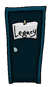
Click the door to access the legacy website. You can also access the website from the footer at the bottom of the homepage.